Bella Mira Home
Rebrand
Bella Mira Home is a crystal and homeware store. They moved from an e-commerce to a physical shop: Bella Mira Home. Having had their logo designed almost 7 years ago, they were due for a rebrand.
Brief:
Design a modern and sleek brand logo in time for the new store opening.
Deliverables:
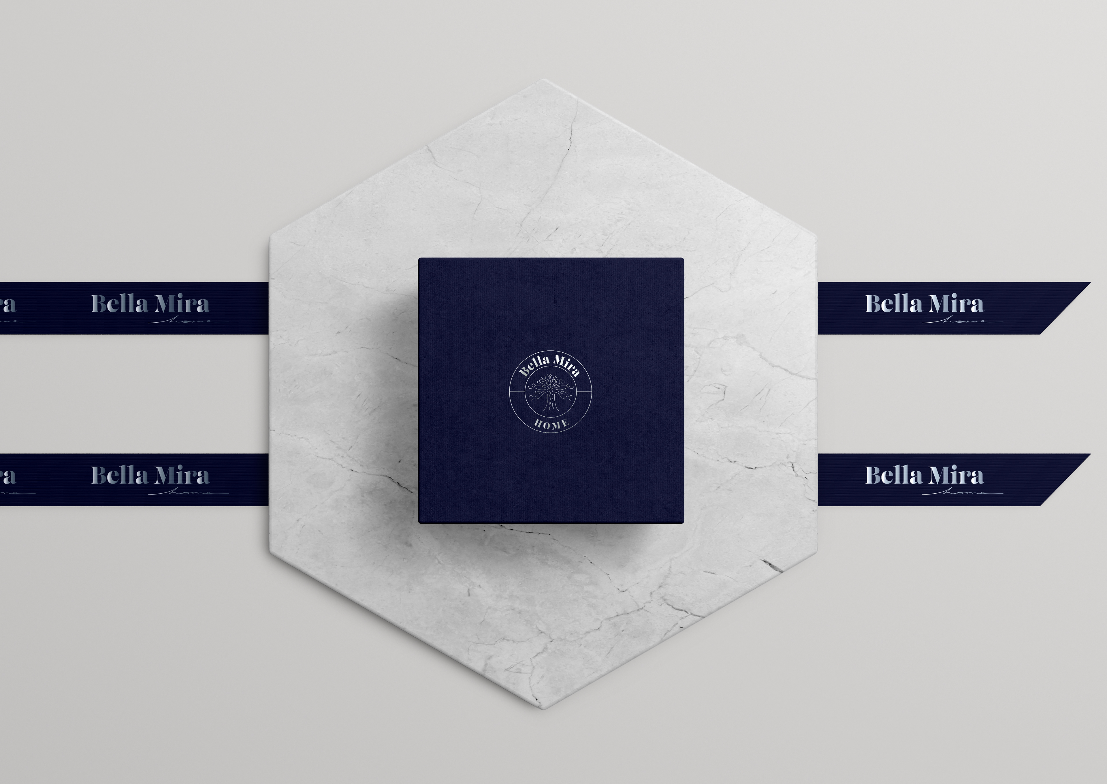
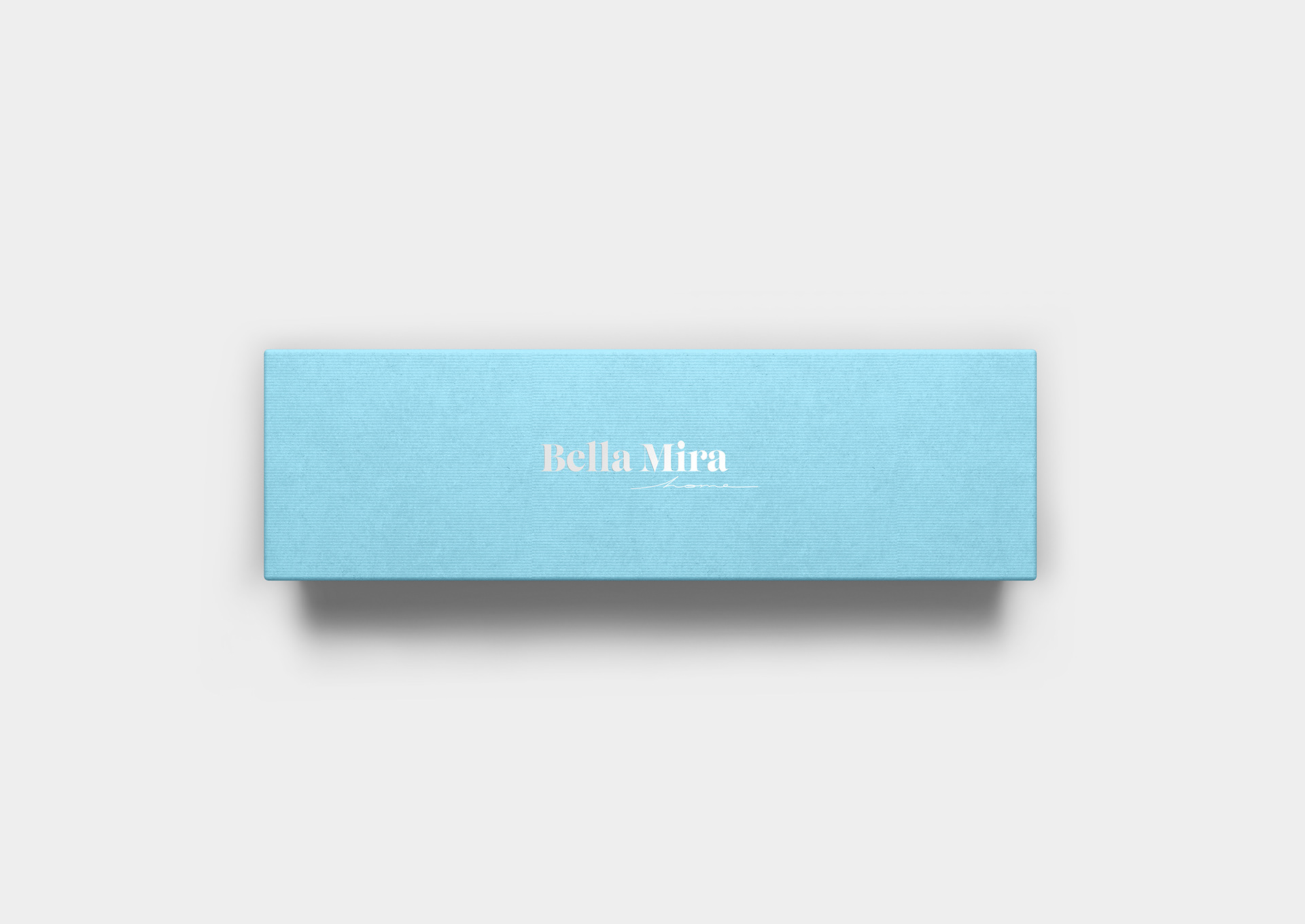
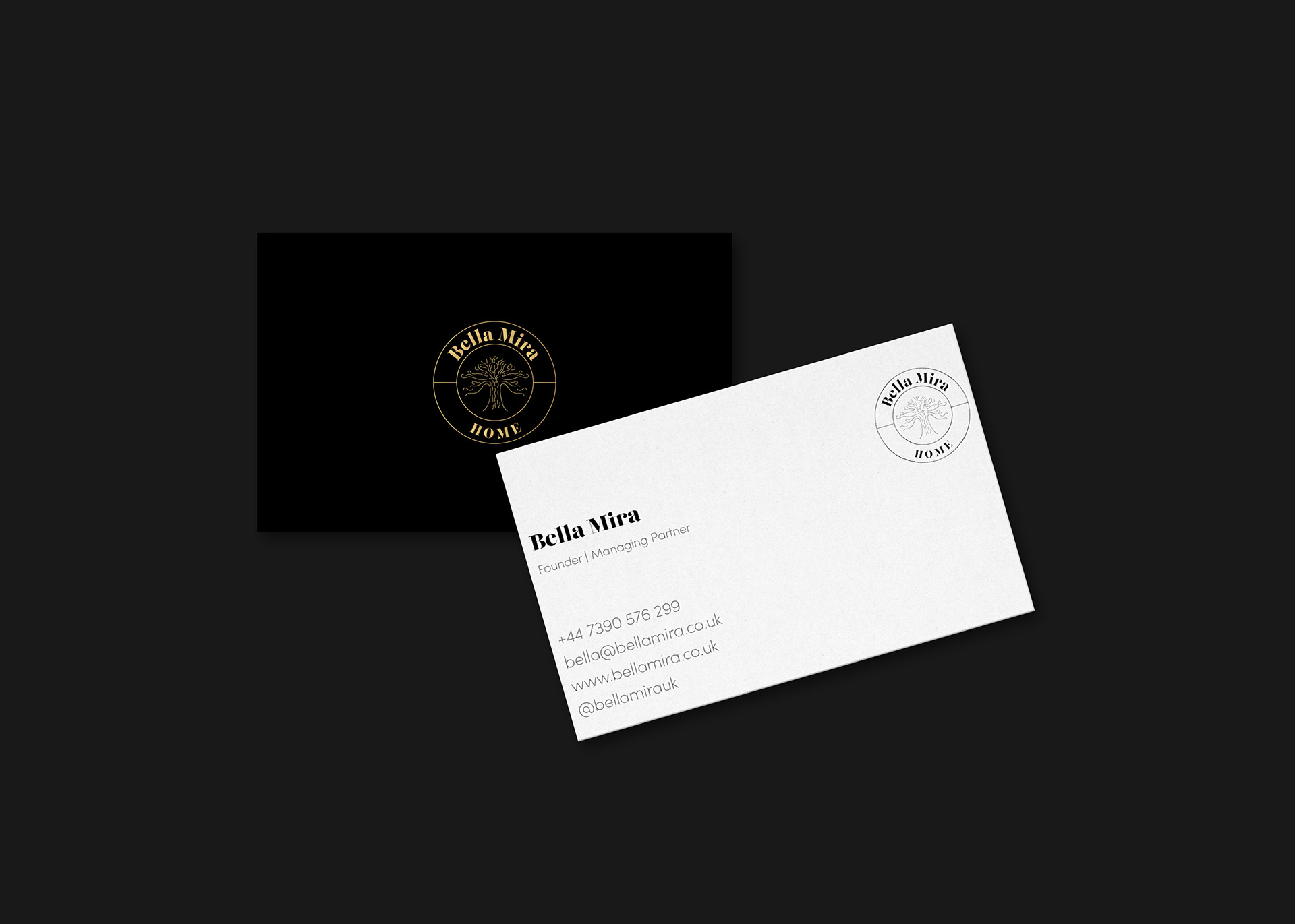
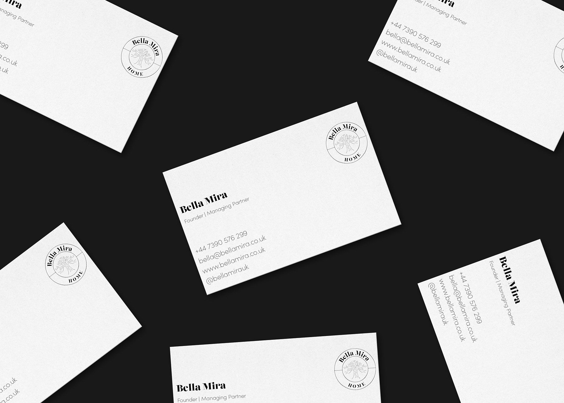
Logo Design | Brand Guidelines | Store Logo | Business Cards | Jewellery Boxes | Social Media
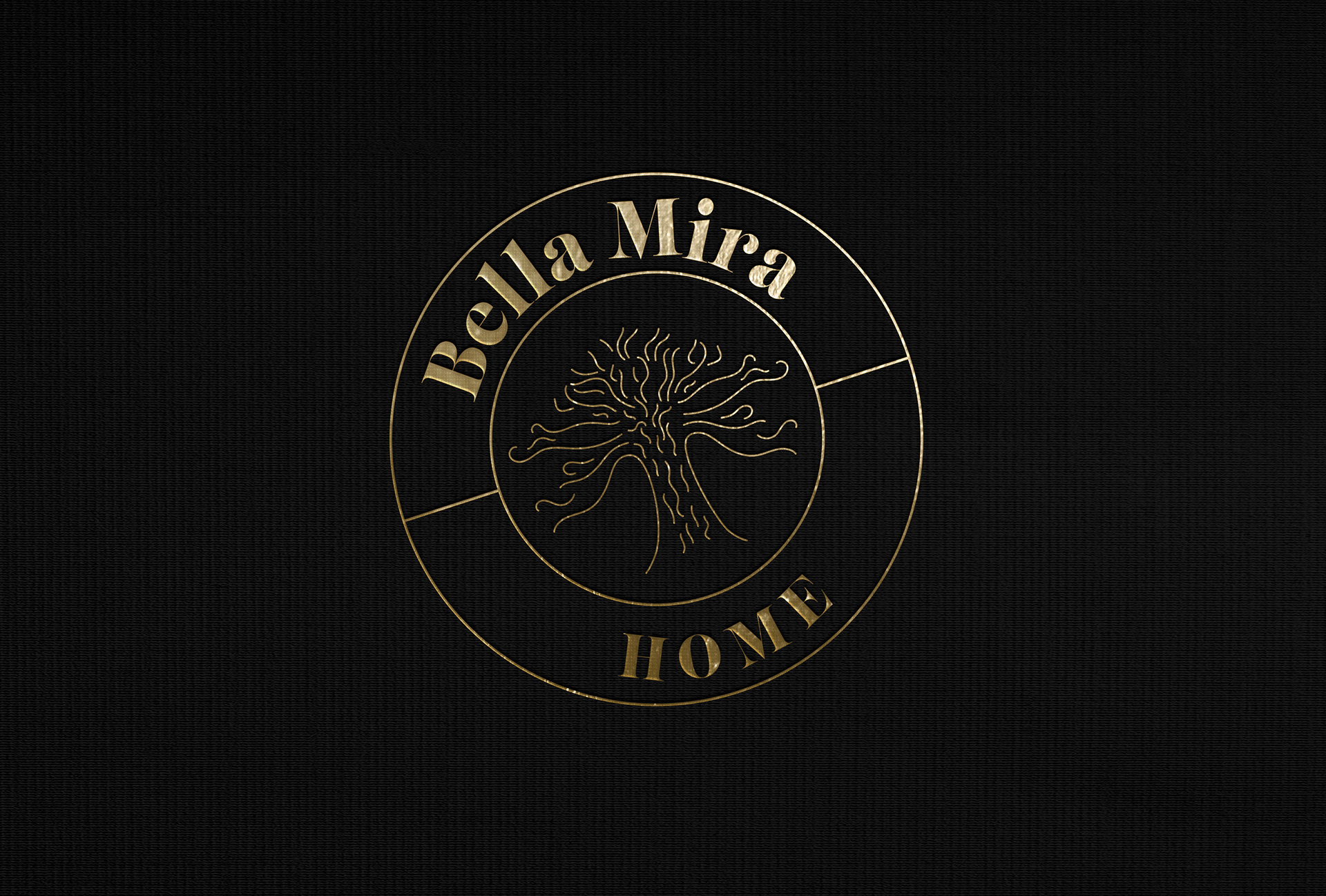
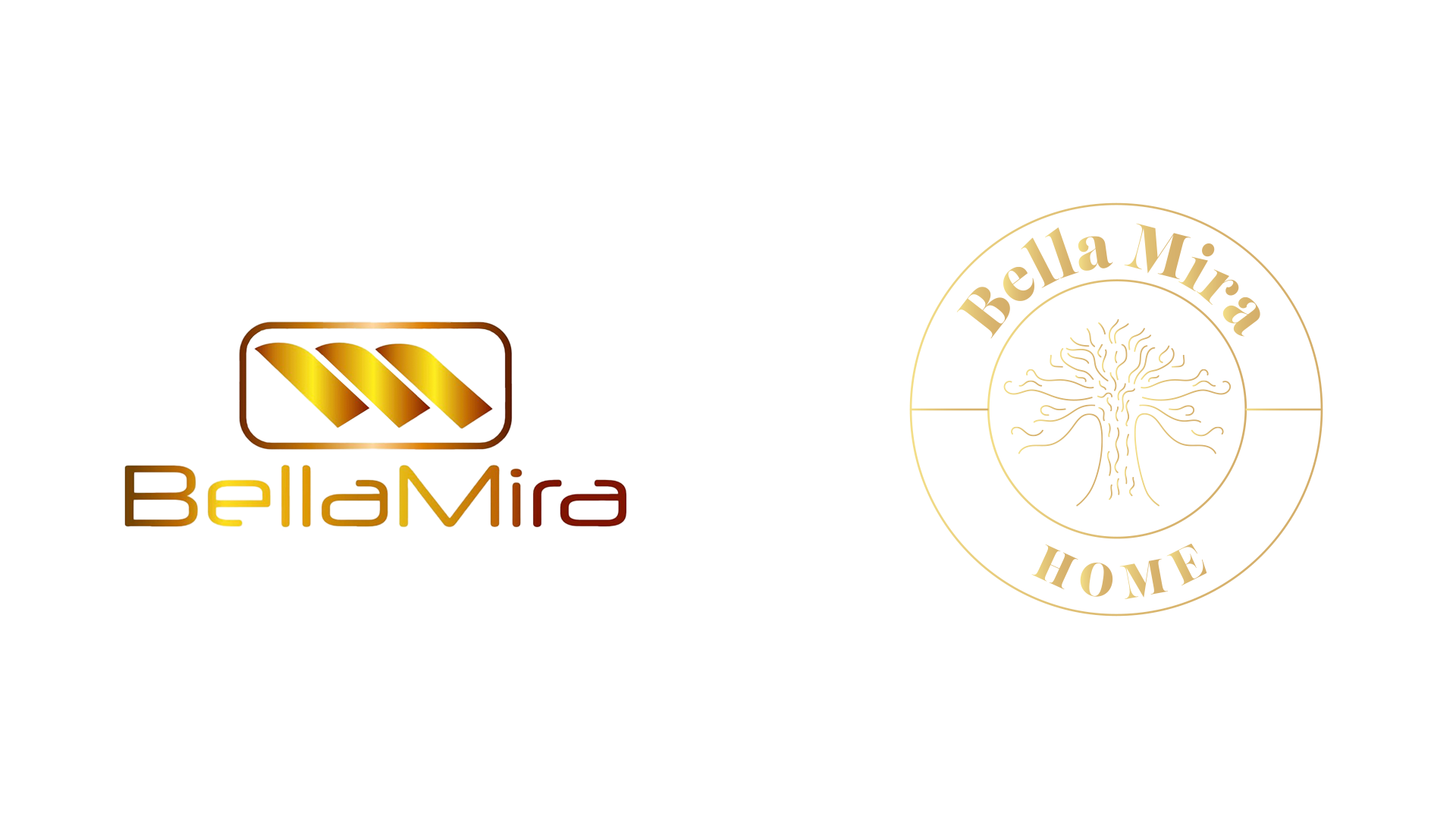
The brand is based on the Tree of Life, a symbol for connection between the world and the afterlife. It is a symbol for our self-development, knowledge and healing. This symbol is present in many of the products and is key to the brand.
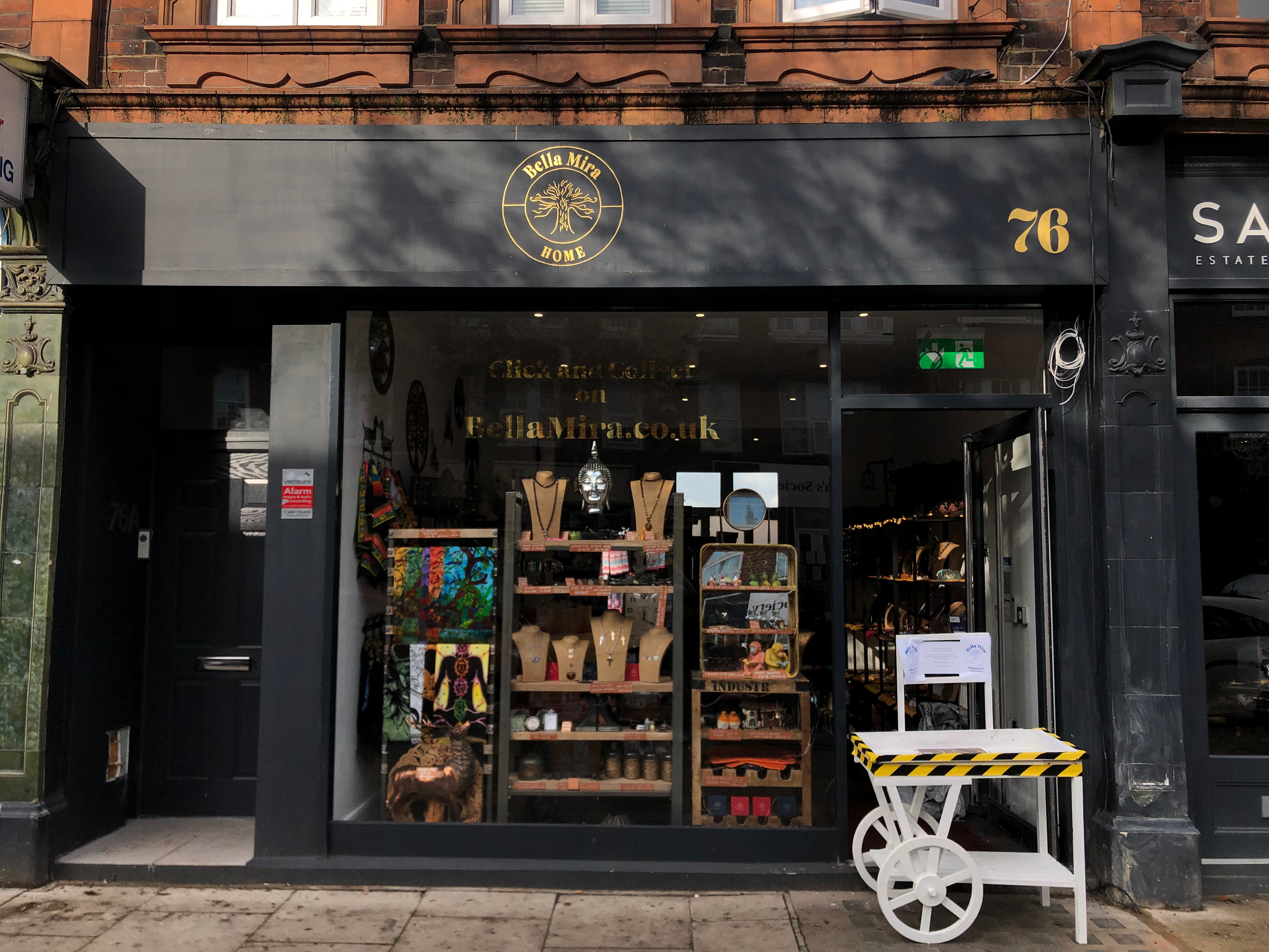
The rebrand brings this symbol to life, whilst adding a touch of luxury to the brand. The Tree of Life is centred in the middle of the logo with the name surrounding it. This represents the ethos of the brand. The logo is simple and easily transferrable.
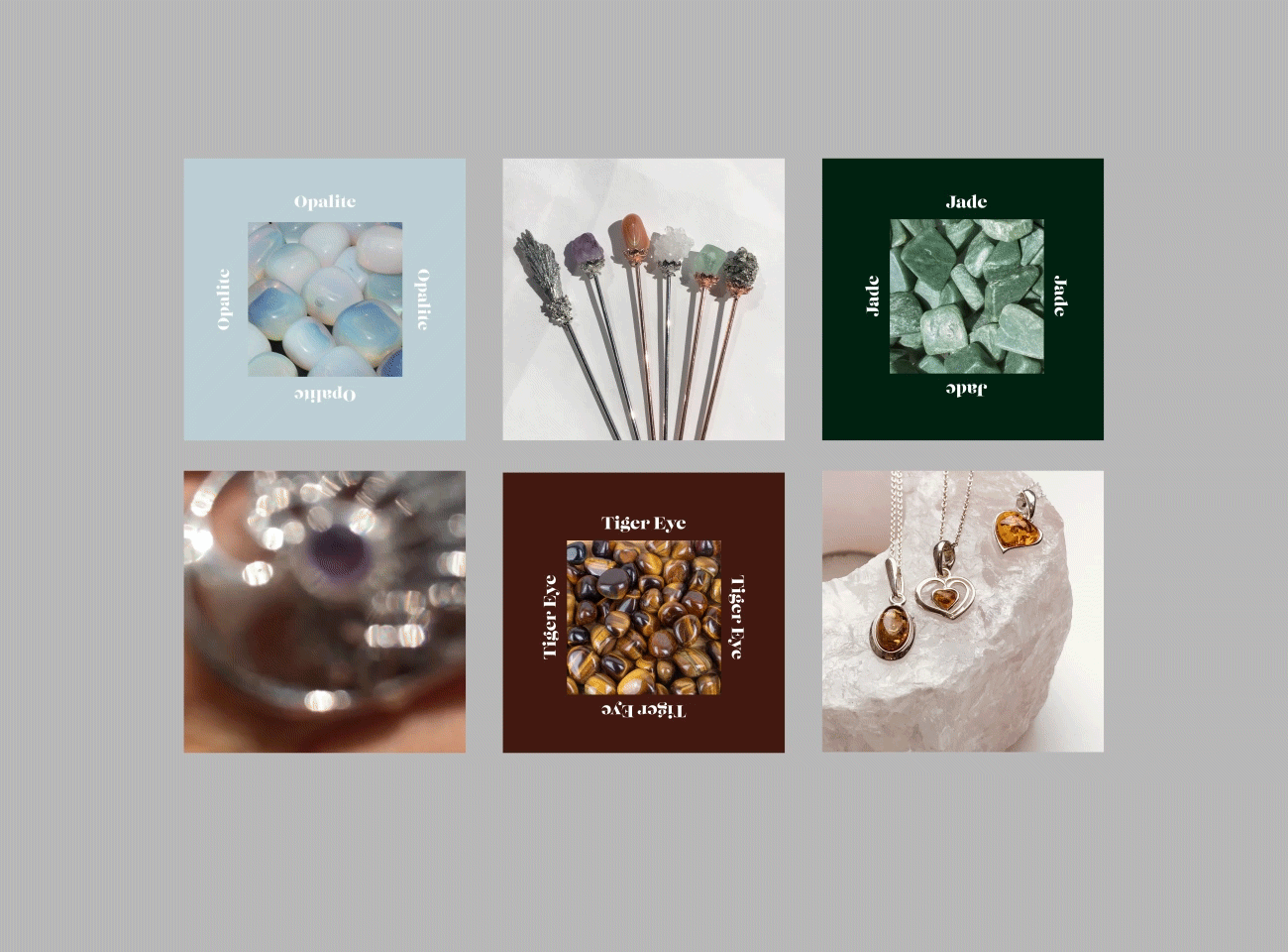
Instagram Feed